Product and tools
Rise 360 Custom Styling Extension
A browser extension that turns Articulate Rise from a closed template system into a fully themeable design platform.
- v1.0 to v1.11, more than 40 releases
- One-click preset themes
- WCAG AAA body text by default
- Styling persists through export
- Role
- Designer and product owner
- With
- Foundation Education
- When
- 2026
- Practice
- Products and tools, Interaction design
Project
Custom CSS injection for the Articulate Rise eLearning authoring tool
As a User Experience Designer at the RTO Foundation Education, I designed and built Rise CSS Customizer, a bespoke browser extension that integrates with the Articulate Rise 360 authoring tool to allow full control over front-end styling and rapid application of fully branded custom themes across entire product suites.
The problem
Articulate Rise 360 is one of the most widely used rapid eLearning authoring tools in the world. What it offers in cross-device functionality with responsive scaling, it lacks in design flexibility. Authors get a handful of preset themes, one accent colour and two font choices. There is no supported way to change button shapes, heading scales, spacing, block colours or component styling and no CSS access at all.
For an organisation that publishes dozens of branded courses, that limitation is a real problem. Every course looks like generic Rise rather than the brand and flexible, intentional design for engaging learner journeys is railroaded. The only "fix" is tedious manual workarounds repeated course by course and requires amending CSS to published files.
There is no pathway to consistent typography, colour and component styling.
The solution
The extension solves this problem by introducing custom CSS injection in a user-friendly package. It is a Chromium-compatible browser extension (Microsoft Edge and Google Chrome) that injects live, fully custom CSS into the Rise authoring environment, previews and the exported course package. All design is both live and permanently applied to exports with one confirmation at publishing.
Designers build a theme from modular style layers. Three no-code tabs each generate one layer:
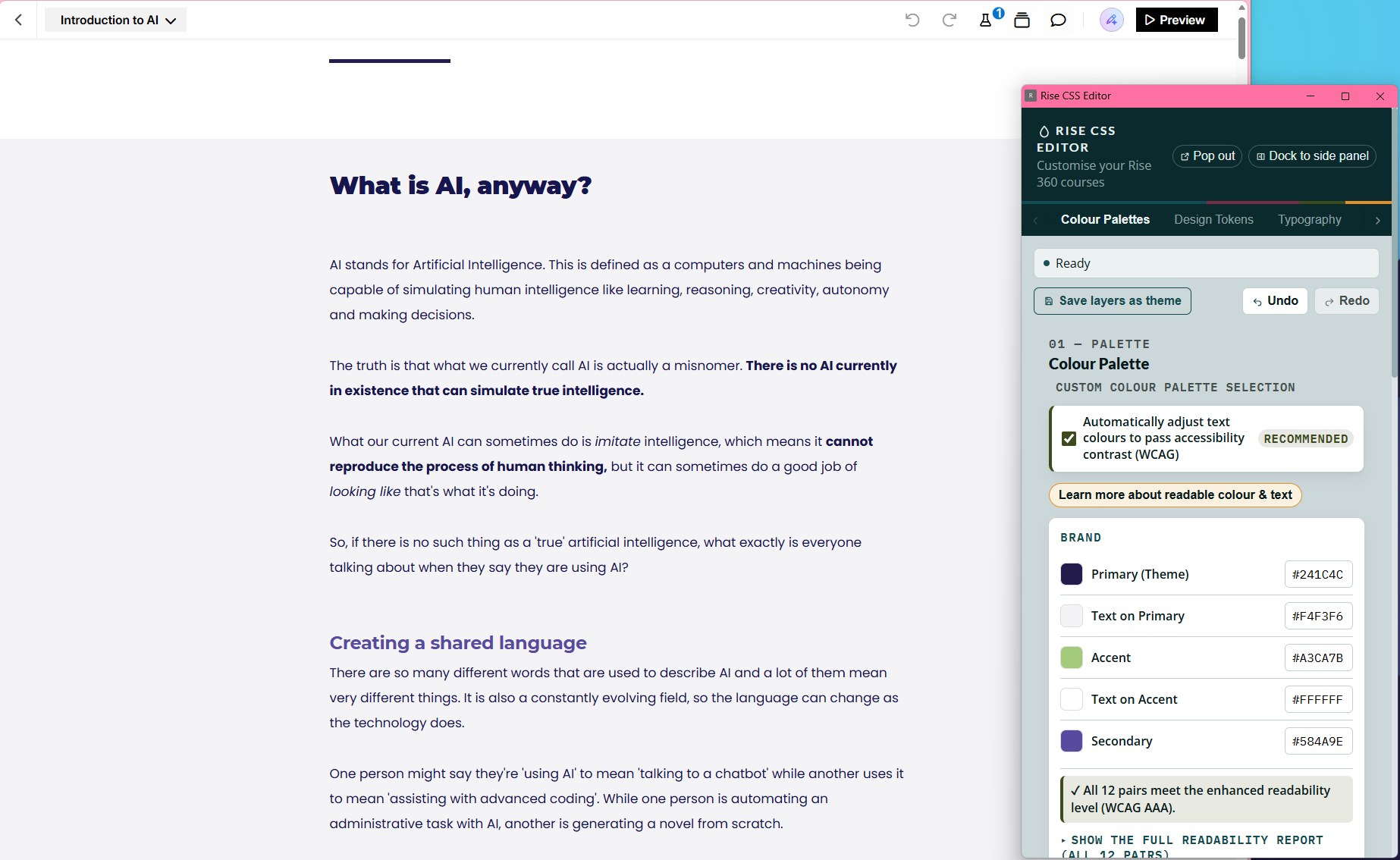
- Colour Palettes: brand colours, the four neutral block backgrounds, body text, card surfaces and quiz feedback icons, with rules for buttons, headings, links and block backgrounds.
- Design Tokens: corner radius for four separate roles (buttons, cards and interactions, images, icons and markers) and a card shadow.
- Typography: font family, weight and size per role (headings, subheadings, body, component titles, buttons), with Google Fonts and Adobe Fonts brought in by pasting a stylesheet link.
Layers are reordered, toggled and live-edited in the cascade, and the whole stack is saved as a preset theme. That theme can then be applied to other courses in a suite with a single click, ensuring consistent, rapid styling for both new and legacy content. Raw CSS is still there for anyone who wants it, in a CSS Editor tab with syntax validation.
This turns Rise from a closed template system into a fully themeable design platform, while keeping the tool's authoring speed and native accessibility and responsive scaling features intact.
Accessibility is built into the tool
A theming tool makes it very easy to produce unreadable courses, so the extension checks its own output. Body text is derived to WCAG AAA (7:1) by default. When a colour fails, it is nudged toward black or white only as far as needed, so it keeps its brand hue. A contrast report lists every text and background pair with its ratio, its AA and AAA status, and an "adjusted" tag wherever the tool corrected a colour.
It is also honest about the limits. Brand fills behind text, such as the text on a primary button, are used exactly as the designer set them and flagged in the report instead of being silently changed. Where full AAA is not mathematically possible, such as text on a mid-grey block, the report shows the real ratio. The tool does not fake compliance.
The editor panel is held to the same standard: a proper keyboard-navigable tab set, visible focus, tooltips that work on hover, focus and touch, reduced-motion support, and plain-language guidance in place of WCAG jargon.
My role
I led this project end to end as the designer and product owner:
- Problem definition and product vision: Identifying the customisation gap in our Rise workflow and framing the solution as a design tool rather than a developer utility.
- UX and interface design: Designing the editor workflow, the modular layer model, the palette, token and typography systems, the theme library and the in-page toggle so a non-technical instructional designer could use it confidently.
- Product direction and iteration: Running a rapid, versioned release cycle (v1.0 through v1.11) with a documented roadmap, changelog, signed-off patch specifications and update guides.
- CSS architecture and authoring: Writing and maintaining the theming CSS itself, including the colour, contrast, typography and component-styling systems.
- Live QA and diagnosis: Testing against real production courses and a dedicated test course containing every Rise block type, inspecting the live DOM to trace rendering bugs, and hardening the styling rules against Rise's frequent internal changes.
I am an instructional and UX designer rather than a software engineer, so the codebase was developed with AI pair-programming assistance under my direction. My contribution was the concept and product roadmap, design thinking, the CSS system, the product decisions, intensive troubleshooting and problem solving during rapid iteration, and the relentless real-world testing that made it reliable.
Process
1. Discovery
I mapped exactly what Rise exposes and what it hides. The key insight: Rise is built on CSS custom properties (like --color-theme), so overriding those variables rather than fighting individual elements could re-theme the whole product cleanly and survive Rise's updates. Research revealed there are no existing products on the market that allow full front-end modular styling with publishing persistence, enterprise safe local hosting, non-subscription service, and a non-programmer friendly user experience.
2. Prototype (v1.0)
I shipped the minimum viable product to prove the concept: a CSS editor, live injection into the Rise page, a floating on/off toggle, and export patching so the styling survived into downloaded SCORM/xAPI/Web packages. This last piece is what separated it from a throwaway browser hack. The CSS actually ships with the course.
3. Make it usable for designers (v1.1)
I added the Colour Palette Manager with visual pickers, auto-rules for buttons, headings, links and backgrounds, and a preset system so a brand theme could be defined once and reused across every project. I refined button targeting so only genuine call-to-action buttons were restyled, not Rise's interactive controls.
4. Build a real design system (v1.2)
I rebuilt the architecture around a multi-layer CSS model: independent, reorderable, toggleable style layers assembled in cascade order, with a single source of truth in browser storage. I added inline editing with auto-save, per-layer import and export, undo and redo, CSS syntax validation, live preview, and a theme library where an applied theme becomes one visible, editable layer pinned to the start of the cascade.
5. Typography and reliability (v1.3)
I tackled the hardest problems: flicker-free custom font loading, weight and contrast integrity across every block type, and defensive rules developed by inspecting the live DOM on real courses. Several bugs were diagnosed directly in the browser, such as discovering that Rise wraps headings in a <strong> tag whose default weight was quietly overriding the theme, and that chart titles sit outside the normal heading container and needed their own coverage. Each fix was written to travel with the theme into published output, not just the editor. This update was about achieving stability across browsers and instances and creating a detailed map of the frankly convoluted Rise styling architecture to ensure the extension's architecture was built to last.
6. Cover every interaction (v1.4 and v1.5)
Coverage was extended to Rise's interactive blocks: labelled-graphic markers and popovers, scenarios, tabs and carousels, each with correct contrast. Tables pasted from other documents can be brand-aligned to the palette, and that alignment persists into the published package. The editor can be popped out into its own window so Rise's own sidebars stay usable while styling. Rise's native block Style menu now previews the palette colours, so the menu matches the applied result.
7. Shape and type without code (v1.6 and v1.7)
The roadmap promised front-end controls to reduce the need to write CSS, and these releases delivered them. The Design Tokens tab added sliders for corner radius across four independent roles plus a card shadow, with each interaction audited in the live DOM so nothing clips or squares off unexpectedly. The Typography tab added per-role font family, weight and size, with web fonts that work in the editor, preview and published exports. Both are non-destructive: nothing is generated until a control is switched on.
8. Accessibility sweep and editor redesign (v1.8 and v1.9)
Version 1.8 moved body text to AAA contrast by default with hue-preserving correction and introduced the dual AA and AAA contrast report. Version 1.9 was a full UI and guidance audit of the editor itself: plain-language advice, a pop-out reference guide, one accessible tooltip system, a real keyboard-navigable tab set, and a layout that leads with the design tabs and treats the CSS Editor as the advanced route. The generated CSS was byte-for-byte unchanged, so no theme needed re-applying.
9. Hardening in the field (v1.10 and v1.11)
With the tool in daily use, the work shifted to field-reported bugs, fixed in specified, staged batches and validated in the browser on a test course containing every Rise block. One fix exempts all of Rise's own editing menus from theme styles in a single pass, verified across 23,795 elements with zero differences to course content. Others corrected text sizes in imported lessons, measured element by element before and after. The floating toggle became draggable and keyboard-movable so it never covers Rise's notifications, and the editor now reopens the way it was last used.
10. What's next
The roadmap continues with bulk layer operations, an SVG asset library, and further coverage of text inside Rise's interactions.
Impact
Impact and outcomes
- Time saved. The rapid application of detailed, branded theming designed to flexibly integrate with Rise native responsiveness and accessibility for stability allowed the Foundation Education and Australian Institute of Personal Trainers product team to action large-scale redevelopment projects almost instantly. This means better outputs at a fraction of the normal development time with no compromise on stability or quality. Entire product suites were reskinned with this method, and the extension will apply themes for all future products, saving countless hours on tedious, manual design and freeing up resources to focus on graphic, UX, and learning design that truly adds value.
- Brand consistency at scale. Courses now carry the full house style including colour, typography, component shape and custom heading scale instead of default Rise. Each brand is captured as a reusable preset that ships with the extension and is applied across its course library.
- Faster production. What was previously impossible (or a manual per-course slog) is now a one-click preset load. Designers theme a course in seconds and keep Rise's rapid-authoring speed.
- No engineering dependency. A non-technical designer can achieve fully custom visual design through toggles, pickers, sliders and presets with no CSS knowledge required. Raw CSS is available when wanted.
- Accessible by default. Text contrast is corrected to WCAG AAA wherever the maths allows and reported truthfully where it does not, so brand theming does not come at the cost of readability.
- Styling that ships. Because the CSS is patched into the export, the brand experience reaches the learner in the LMS, not just the authoring preview.
- Private and local. Everything runs in the browser with no external services, telemetry or subscription, which keeps it safe for enterprise use.
- Battle-tested reliability. More than 40 documented releases, each hardened against real Rise courses through live DOM diagnosis, with a changelog, roadmap, patch specifications and update guides.
Gallery
Try it
A working model of the editor lives in the Playground: the same tabs and layer system, pointed at a mock lesson.