Innovation
I have a love of building technologically-enabled design-driven creative solutions to practical, human problems. There is so much joy in experimentation and, like a kid in a sandpit, I have never stopped getting a thrill at seeing an empty space and imagining what I can build there.
I am always open to learning new technologies and platforms, with a strong capacity to rapidly acquire new skills. If I don’t know how something works, I will learn it. If I don’t like how something works, I will build something that makes it work better.
The Happy Place Project

What’s Your Happy Place? Co-Design of Personalised Immersive Environments for Paediatric Persistent Pain
Institution: Queensland University of Technology
Degree: Master of Philosophy (Design)
Specialisation: Designing for Health and Future Technologies
Completion: 2026
Awards: Australian Government Research Training Program Stipend | First Place, Queensland Falling Walls Lab
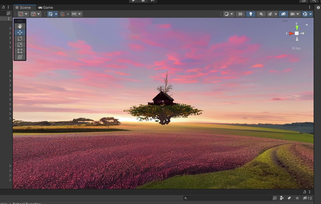
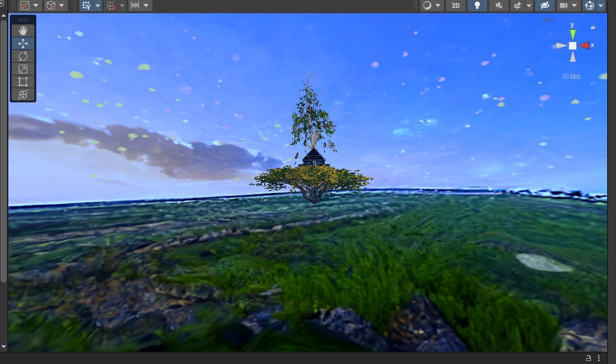
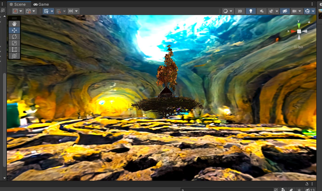
The Happy Place project is practice-led research exploring the co-design of personalised immersive environments for paediatric persistent pain management. Working in consultation with a Brisbane-based paediatric pain clinic to develop a clinically informed co-design kit, this research looks at the process of developing bespoke VR environments for persistent pain self-management. The take-home kits use artistic activities to facilitate creative self-expression of young participants, the results of which then inform the design of their very own ‘Happy Place’, aka their own personalised immersive environment.
Design approach and methodology
I applied a hybrid ADDIE and Action Mapping methodology to develop a curriculum aligned to complex regulatory frameworks, including the Strengthened Aged Care Quality Standards and the new Aged Care Act. My pedagogical approach centres on adult learning principles, favouring scenario-based and narrative-driven learning with embedded reflective practice to contextualise complex theory through real world application. Creative storytelling sits at the heart of the library’s design, ensuring that content is not only compliant but genuinely engaging and memorable for learners.
The library was designed with a strong foundation of person-centred, rights-based care principles. I championed this model from the earliest stages of development, integrating it into the library’s foundation even before the full details of the Strengthened Standards and the Statement of Rights were publicly released. This approach reflects my commitment to human-centred design practices and improved outcomes for vulnerable people.
Accessibility and inclusive design
A key priority throughout the project was designing for accessibility and inclusion. All materials comply with WCAG accessibility standards and were developed with careful consideration for the significant number of culturally and linguistically diverse (CALD) workers who comprise the aged care workforce. The library also supports neurodiverse learners and those with varying levels of digital literacy, applying Universal Design for Learning principles to ensure genuinely inclusive learning experiences.
Collaboration and stakeholder engagement
Developing the library required extensive collaboration with clinical Subject Matter Experts, graphic designers, quality assurance officers, marketing teams, and external stakeholders. I shaped the creative and pedagogical vision of the product suite, guiding a multidisciplinary team to execute the creation of a comprehensive library of educational assets, including in house video content, graphic design assets, and creative storytelling approaches designed to drive behavioural outcomes for healthcare workers. I also led the Aged Care content roadmap to ensure product planning remained responsive to the rapidly changing needs of the sector.
Navigating sector reform
The library was developed during a period of once-in-a-generation sector reform driven by the introduction of the new Aged Care Act. This required me to deeply immerse myself in public policy, legislation, and regulatory standards, strategically extrapolating from available information to build a curriculum that anticipated evolving requirements. The result was a product that achieved high adoption in a relatively short period and positioned etrainu competitively in the aged care training market.
Multimedia and video production
As part of the library’s development, I leveraged my background in film and video to establish in-house video production capabilities at etrainu. This involved building production infrastructure, training staff in video production techniques, engaging external videographers and editors, and implementing an online video content platform leveraging asset libraries and AI tools for scalable animation content. These capabilities extended beyond my own product and contributed to broader organisational capacity.
For detailed examples of my instructional video work, check out my Film and Video portfolio page.
Research outcomes
This project is in progress with intended completion in 2026. I am in the process of finalising my thesis for submission and preparing to submit for publication.
In the interest of not getting ahead of publication, I will include a more detailed summary of outcomes when they become publicly available.
Recognition and awards
- Awarded an Australian Government Research Training Program Stipend
- First place at the Queensland Falling Walls Lab, presented by the Honourable Dr Jeanette Young AC PSM


Rise 360 Custom Styling Extension
Custom CSS injection for the Articulate Rise eLearning authoring tool
As a User Experience Designer at the RTO Foundation Education, I designed and built a bespoke browser extension that integrated with the Articulate Rise 360 authoring tool to allow for full control over front-end styling and rapid application of fully branded custom themes across entire product suits.
The problem
Articulate Rise 360 is one of the most widely used rapid eLearning authoring tools in the world. What it offers in cross-device functionality with responsive scaling, it lacks in design flexibility. Authors get a handful of preset themes, one accent colour and two font choices. There is no supported way to change button shapes, heading scales, spacing, block colours or component styling and no CSS access at all.
For an organisation that publishes dozens of branded courses, that limitation is a real problem. Every course looks like generic Rise rather than the brand and flexible, intentional design for engaging learner journeys is railroaded. The only “fix” is tedious manual workarounds repeated course by course and requires amending CSS to published files.
There is no pathway to consistent typography, colour and component styling.
The solution
Rise Custom Styling browser extension solves this problem by introducing custom CSS injection in a user-friendly package. It is a Chromium-compatible browser extension that injects live, fully custom CSS into the Rise authoring environment, previews and the exported course package. All design is both live and permanently applied to all exports with only one click at publishing.
Designers can use modular CSS blocks created through front-end styling systems such as the built-in colour-palette and custom CSS snippets, reorder and live-edit them in the cascade, and save their final design as a preset theme. This theme can then be applied to other courses in a suite with a single click, ensuring consistent, rapid styling for both new and legacy content.
This turns Rise from a closed template system into a fully themeable design platform, while keeping the tool’s authoring speed and native accessibility and responsive scaling features intact. It does this through a friendly visual interface built for designers, not developers: colour pickers, toggles, reusable presets and a layered style manager, with raw CSS available for anyone who wants it.
My role
I led this project end to end as the designer and product owner:
- Problem definition and product vision: Identifying the customisation gap in our Rise workflow and framing the solution as a design tool rather than a developer utility.
- UX and interface design: Designing the side-panel workflow, the modular layer model, the colour-palette system and the in-page toggle so a non-technical instructional designer could use it confidently.
- Product direction and iteration: Running a rapid, versioned release cycle (v1.0 through v1.3) with a documented roadmap, changelog and update guides.
- CSS architecture and authoring: Writing and maintaining the theming CSS itself, including the colour, contrast, typography and component-styling systems.
- Live QA and diagnosis: Testing against real production courses, inspecting the live DOM to trace rendering bugs, and hardening the styling rules against Rise’s frequent internal changes
I am an instructional and UX designer rather than a software engineer, so the codebase was developed with AI pair-programming assistance under my direction. My contribution was the concept and product roadmap, design thinking, the CSS system, the product decisions, intensive troubleshooting and problem solving during rapid iteration, and the relentless real-world testing that made it reliable.
1. Discovery
I mapped exactly what Rise exposes and what it hides. The key insight: Rise is built on CSS custom properties (like --color-theme), so overriding those variables rather than fighting individual elements could re-theme the whole product cleanly and survive Rise’s updates. Research revealed there are no existing products on the market that allow full front-end modular styling with publishing persistence, enterprise safe local hosting, non-subscription service, and a non-programmer friendly user experience.
2. Prototype (v1.0)
I shipped the minimum viable product to prove the concept: a CSS editor, live injection into the Rise page, a floating on/off toggle, and export patching so the styling survived into downloaded SCORM/xAPI/Web packages. This last piece is what separated it from a throwaway browser hack. The CSS actually ships with the course.
3. Make it usable for designers (v1.1)
I added the Colour Palette Manager with visual pickers, auto-rules for buttons, headings, links and backgrounds, and a preset system so a brand theme could be defined once and reused across every project. I refined button targeting so only genuine call-to-action buttons were restyled, not Rise’s interactive controls.
4. Build a real design system (v1.2)
I rebuilt the architecture around a multi-layer CSS model: independent, reorderable, toggleable style layers (palette, manual, imported) assembled in cascade order, with a single source of truth in browser storage. I added inline editing with auto-save, per-layer import/export, automated CSS validation and re-injection so nothing needed manual reapplying.
5. Typography and reliability (v1.3)
I tackled the hardest problems: flicker-free custom font loading, weight and contrast integrity across every block type, and defensive rules developed by inspecting the live DOM on real courses. Several bugs were diagnosed directly in the browser, such as discovering that Rise wraps headings in a <strong> tag whose default weight was quietly overriding the theme, and that chart titles sit outside the normal heading container and needed their own coverage. Each fix was written to travel with the theme into published output, not just the editor. This update was about achieving stability across browsers and instances and creating a detailed map of the frankly convoluted Rise styling architecture to ensure the extensional architecture was built to last.
6. Future updates
This product is currently useable and actively applied in our workflow at my organisation. However, there are a suit of planned updates in the product roadmap including additional front-end styling toggles and sliders for typography and component styling to reduce the burden on users to apply CSS directly.
Impact and outcomes
- Time saved
The rapid application of detailed, branded theming designed to flexibly integrate with Rise native responsiveness and accessibility for stability allowed the Foundation Education and Australian Institute of Personal Trainers product team to action large-scale redevelopment projects almost instantly. This means better outputs at a fraction of the normal development time with no compromise on stability or quality. Entire product suits were reskinned with this method, and the extension will apply themes for all future products, saving countless hours on tedious, manual design and freeing up resources to focus on graphic, UX, and learning design that truly adds value. - Brand consistency at scale
Courses now carry the full house style including colour, typography, square-cornered components, custom heading scale instead of default Rise. The AIPT theme is captured as a single reusable preset applied across the course library. - Faster production
What was previously impossible (or a manual per-course slog) is now a one-click preset load. Designers theme a course in seconds and keep Rise’s rapid-authoring speed. - No engineering dependency
A non-technical designer can achieve fully custom visual design through toggles, pickers and presets with no CSS knowledge required. Raw CSS is available when wanted. - Styling that ships
Because the CSS is patched into the export, the brand experience reaches the learner in the LMS, not just the authoring preview. - Battle-tested reliability
Ten-plus iterative releases, each hardened against real Rise courses through live DOM diagnosis, with a documented changelog, roadmap and update guides.


Chameleon Catcher Extension
Leveraging AI to solve the problem of rapid, large-scale data migration
In my time as an Instructional Designer at etrainu, we were faced with the challenge of extracting a massive legacy content library and transforming it into a release-ready product in the period of only a few short months. We needed to take hundreds of courses, reshape the content using AI for first-pass redevelopment while maintaining high enough fidelity to ensure no loss of information.
The legacy content existed primarily in the authoring tool itself (Chameleon Creator) with no transcripts, content documents, or other artefacts that would have allowed for easy migration and transformation of raw course content. Chameleon only allows SCORM export with no HTML or transcript options, meaning that extracting the content for redevelopment was a tedious act of manually copy and pasting every individual slide, feedback layers and all.
I looked at this process, imagined the weeks of boredom and profound inefficiency, and I said “I am absolutely not doing that.” I decided that a pathway to automation must exist and if not, I would find a way to build it.
Chameleon Catcher overview
The Chameleon Catcher extension was built to solve a high-friction content problem: capturing complex Chameleon Creator learning modules in a way that preserves both their human readability and their structural meaning. Chameleon content is not limited to static text and media; it includes topic portals, branching navigation, results pages, click-to-reveal interactions, flipcards, carousels, accordions, quiz-based interactions, and lockdown-based progression rules.
My objective was to create an extension that could translate this interactive learning environment into a stable transcript and export layer without reducing it to a messy DOM scrape or a visually cluttered dump of content. The result was a tool designed not just to capture pages, but to capture intent, sequence, and learning structure.
The challenge
Building a capture tool for Chameleon Creator meant working with content that is far more complex than a standard webpage. The extension needed to interpret not just visible text, but the logic of interactive learning experiences — including branching pathways, locked progression, quiz flows, reveal interactions, and results states.
The core challenge was balancing two needs at once:
-
Human readability: the output had to feel clean, logical, and easy to review
-
Structural fidelity: the captured content still needed to preserve sequence, interaction type, and semantic meaning for downstream use
-
Usability: the tool needed to be practical in real workflows, not just technically impressive
-
Reliability: automation had to stay stable across varied module structures and edge cases
A simple export would have flattened the experience. A highly technical export would have made it unreadable. The challenge was designing something that could do both well.
Project goal
The goal of the extension was to create a workflow that translated interactive courseware into a format that was both usable by people and valuable to machines.
More specifically, I wanted to create a tool that could:
-
Generate a clean, readable HTML transcript
-
Preserve a semantic layer for AI-assisted conversion and structured reuse
-
Support downstream outputs such as DOCX and future PPTX-compatible semantic exports for cross-platform use
-
Retain enough interaction context to make the content meaningful outside the browser
-
Remain stable enough to support repeatable capture and QA workflows
This was ultimately about turning highly interactive learning content into a portable knowledge asset.
My approach
I approached the project using a human-centred, iterative design methodology. Rather than trying to build a perfect solution in one pass, I worked through rapid cycles of testing, troubleshooting, refining, and validating the extension against real content and real output needs.
A key part of the process was using ChatGPT as a development partner, but in a directed, highly active way. My role was not passive prompting. I drove the conceptual and technical process by:
-
Defining the original problem and desired outcomes
-
Shaping the transcript model and output requirements
-
Using browser developer tools to inspect page structure, state changes, and DOM patterns
-
Pulling relevant code and diagnostic information into the workflow for troubleshooting, analysis, and crucial build context
-
Defining and redefining rules, parameters, and workflows as issues emerged
-
Troubleshooting failures, edge cases, and unstable behaviours
-
Testing outputs for readability, usability, and structural consistency
-
Continually tightening the process to improve efficiency, accuracy, and overall result quality
This approach allowed me to leverage my existing experience with game engines, authoring tools, interaction design, and digital learning systems so that even with limited traditional front-end engineering experience, I could create a highly complex automation tool. AI accelerated the coding, but the product direction, problem framing, refinement, and quality control were driven by me.
Innovation
The most innovative aspect of this project was not just that it automated capture, but that it did so in a way that respected both content meaning and user experience.
Key innovations included:
-
A dual-layer output model: human-readable transcript plus machine-readable semantic structure
-
A capture process that preserved interaction intent and fidelity of the user journey, not just visible text
-
An approach to automation that treated behaviour, flow, and learning logic as part of the content
-
A design process that combined AI-assisted development with human-centred design thinking and continuous refinement
The project demonstrates an important capability: the ability to use AI not simply to generate code, but to extend personal technical reach and deliver a sophisticated product through strong conceptual thinking, problem-solving, and iterative design leadership.
Outcome
The final outcome was an extension that made interactive learning content significantly more reusable and resilient. It produced transcripts that were easier for people to read, more dependable for QA and support workflows, and better suited for AI-assisted document generation than a conventional page capture would be. Because it preserved the instructional logic of Chameleon content rather than flattening it, the extension helped bridge the gap between interactive delivery and durable documentation.
More broadly, the project demonstrated how browser extensions can be used not just as capture utilities, but as translation layers between rich web experiences and structured knowledge systems.
Business impact
As an immediate result of this project, weeks of actual labour were shaved off the timeline of a business-critical project. This freed up the team to direct their focus to the vital work of content redevelopment.
This extension also preemptively solves future problems, such as providing a high-fidelity transcript accurate the most recently published text for generating voice overs, as is intended down the line. It will also support the Customer Success team in routine troubleshooting, as the extension is specifically designed to navigate courses using exclusively learner-faithful navigation and interaction, effectively replicating the user experience.
The cumulative time, resources, labour, and ultimately money saved by this automation tool will compound over moths and years to be enourmous.
Reflection
This project sits at the intersection of frontend engineering, content architecture, and AI readiness. What I am most proud of is that the extension did not treat innovation as visual polish alone. Instead, it introduced a more durable model for representing interactive content: one that respects the learner experience, supports human review, and creates a stable foundation for machine-driven reuse.
That balance between usability and semantics, between readability and structure, is what made the extension meaningful.

